The New Taxi Logo is Blobby
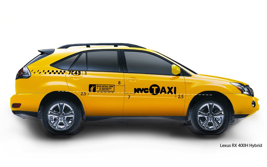
the new NYC taxi logo on a Lexus 400 Hybrid; from NYC TLC website
We began seeing the 'new' New York City Taxi logo on cabs around town earlier this week. At first we thought it was possibly a film car from a movie shoot, imported from a place where the prop master had never seen a real New York cab and was winging it when he painted it. Or a rogue medallion owner decided to violate Taxi & Limousine Commission specs and give his car a makeover. Either way, until we saw several more (and by Friday night the infestation had gone critical), we never considered that this could be the new standard. Why? Because the logo is, well, just so damn...blobby.
We used 'new' in quotes here because the previous NYC Taxi logo was not a logo at all. It was either a decal in 50 point Helvetica or a spray-painted stencil reading "NYC Taxi". So the idea of a logo treatment is very appealing. The old identifiers had all the panache of army surplus vehicles or Chinatown delivery trucks.
But the new look - created gratis for the city by Smart Design, a brand identity and design shop who's created some fantastically-elegant products (OXO kitchenware, XM's SKYFI receiver) and brand communication (Simple Human's branding and packaging) - is heavy and awkward. At a glance, it looks like someone painted it freehand with a too-large brush. Or stenciled it with too much black paint, which oozed in all directions.
We're no typographers, but the "NYC" portion looks like a variant on the old Varsity font (outline removed), turned ultra-bold and short-tracked until the letters run together. Super blobby.
The "TAXI" portion consists of a rounded sans-serif "T" (different font) knocked out of a big black circle (ripping off the MTA's subway line designators?), and the "AXI" in positive lettering that's been pushed away by the big black circle to the point that "AXI" reads as a separate word. Mediabistro nailed it: "Sir, can you call me a T-Axi?"
For the record, we love the checkerboard reference on the rear quarter panel. The fading checker pattern looks like a graphic representation of a bitstream, and makes the cab look like its going fast, even when its locked in the Holland Tunnel approach lane on a Friday afternoon. The fare panel, which is also a decent modernization of the old barber-shop menu decal, swaps positions with the new logo and lives on the rear passenger doors where it belongs. But the pricing info (which competes for space with a cute-but-unnecessary cab hailing person icon) is impossibly small; possibly it was made intentionally illegible, given the two recent fare increases.
Sorry to be so critical (though that's what we do best, isn't it?), but when you set out to redesign something as iconic as the look of an NYC Taxi, its important to get it right. Given the pace of change at the TLC, we'll likely be stuck with the blobby taxi logos for decades to come.
posted by i'mnotsayin @ 10:24 AM
7 comments
![]()

